✓
Walls
✓
Wood
✓
Signage
✓
Specials
Decors: Festival decors
Signage: From floor graphics to traditional chalkboards: signage can take many forms, but is essentially an extension of company branding. As such it has an important and specific role to play. Here are some examples.
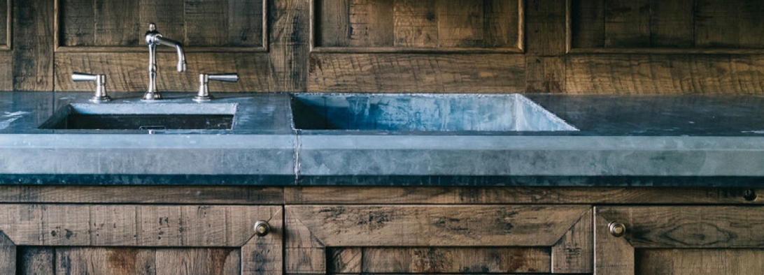
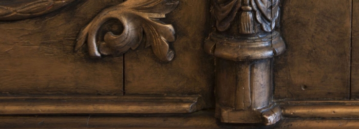
Wood: Planks, solid wood or veneer, reclaimed or new; wood provides a versatile base material for a variety of decorative finishes. We often avoid off-the-shelf colours and products, instead creating project-specific mixes and recipes. Here are some examples.
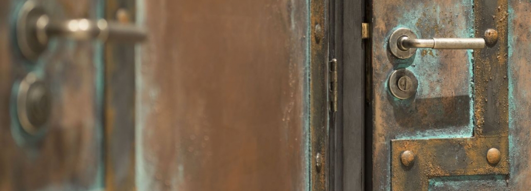
Walls: New-build materials can be transformed by decorative paintwork and plastering. We often create project-specific mixes and recipes. From vintage mural advertising and peeling paint to antique copper, rust, concrete or stone: this category showcases a range of painted and illustrative projects.
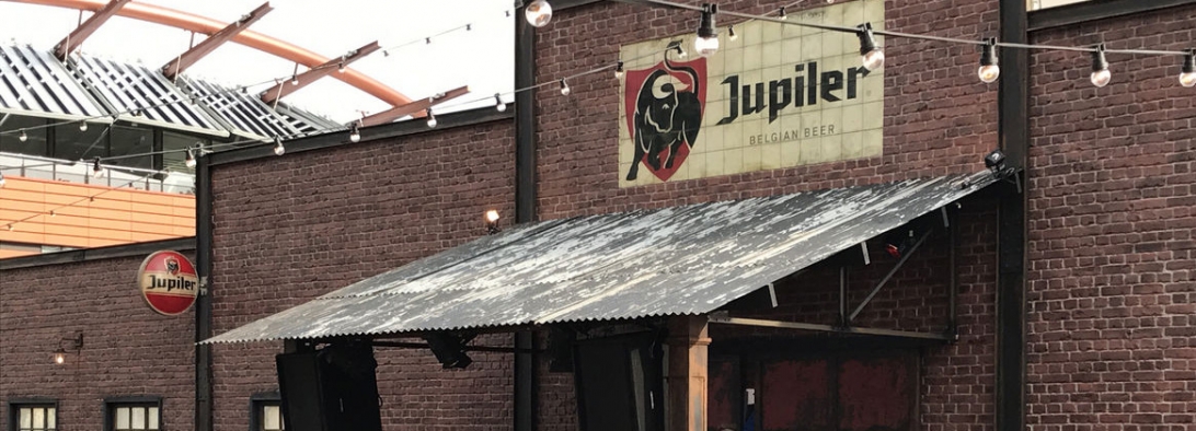
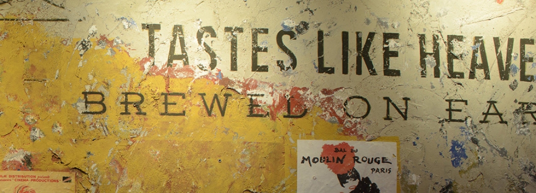
Blokes, Groningen
View project
Blokes is a popular bar in the student heart of Groningen, serving food, beer and cocktails.
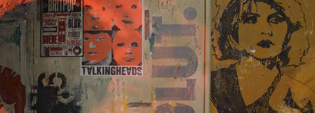
At the rear of the bar is the Backroom; the decorative work here is intended to evoke the feel of Montmartre nightlife. Mumford Visuals created a mural combining posters and painted imagery, on aged plasterwork.
Commissioned by Duvel/Blokes
Photographs courtesy of Tiemen Voorhorst
Commissioned by Duvel/Blokes
Photographs courtesy of Tiemen Voorhorst
Pakhuis, Groningen
View project
In 1973 Het Pakhuis first opened its doors as an artist’s music café in the centre of the university city of Groningen. These creative beginnings still influence the style and atmosphere today.
Since 2007 the building has been under new ownership; upstairs a restaurant serving fresh food daily, downstairs a lively dancebar with a mix of DJs and bands. In order to reflect the colourful musical history of Het Pakhuis, Mumford Visuals created walls with an urban feel using mixed media; collaged vintage music posters, plaster, stencils and painted details. The DJ corner was given a rust finish.
Photographs courtesy of Tiemen Voorhorst
Photographs courtesy of Tiemen Voorhorst
De Wheem, Meppel
View project
Grand Café de Wheem is situated in the very heart of Meppel, in a former library building.
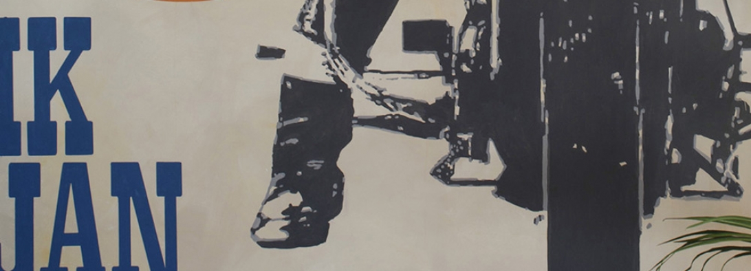
This historical detail was the inspiration for a mural depicting the front cover of the book, Ik, Jan Cremer by the sixties Dutch writer of the same name, in a vintage style.
Commissioned by Heineken/De Wheem, photographs courtesy of Tiemen Voorhorst
Commissioned by Heineken/De Wheem, photographs courtesy of Tiemen Voorhorst
Veneta, Zwolle
View project
Mumford Visuals was asked to work on the staff restaurant, a characteristic interior with an urban feel.
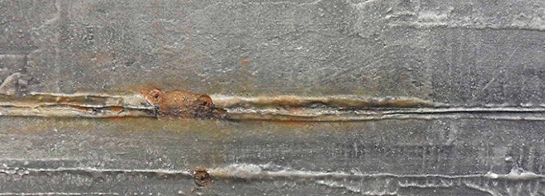
Walls are plastered to create industrial cement look and the new ventilation systems made old and rusty. Other elements included cartoon illustrations of company policies.
Soho House, Amsterdam
View project
Soho House Amsterdam occupies the iconic Bungehuis
building on the Singel canal, which was built in the 1930s
as a trading office before becoming a university building
in the 1970s. The six-storey building is characterised by
architectural details including a limestone and granite-clad
façade, Art Deco lighting flanking the entrance and
bronze-framed bay windows.
For this project Mumford Visuals worked on the new-build materials installed during the building's extensive refurbishment. All new wood was stained and aged in order to help recreate and compliment the period feel of this remarkable interior. Work was carried out in the fifth floor members-only hospitality and lounge areas, the ground floor reception area, and the house gym.
Photo's partly courtesy of Soho House.
Photo's partly courtesy of Soho House.
www.sohohouse.com
The Hoxton, Amsterdam
View project
The Hoxton Amsterdam is part of a chain of hotels, originating in London and now spread across the globe.
The Hoxtons philosophy is based on relaxed and well designed city spaces, with hospitality areas accessible to all.
The Hoxtons philosophy is based on relaxed and well designed city spaces, with hospitality areas accessible to all.
For Lotti's restaurant and adjacent hospitality areas Mumford Visuals worked on a variety of wood finishes, employing craquele and aging techniques to establish a vintage feel.
Commissioned by Inris Interieurbouw.
Photos partly courtesy of the Hoxton.
Commissioned by Inris Interieurbouw.
Photos partly courtesy of the Hoxton.
www.thehoxton.com
Mofongos Grand Cafe and Restaurant, Groningen
View project
Mofongos comprises many different restaurant and
bar spaces, spread over several buildings and floors. One space leads
seamlessly into another.
Mofongos Grand Café and Restaurant boasts a world menu and this eclectic mix is reflected in the décor, from a fresco style wall of meat cuts and oxidised metal to the grandeur of marble imitation.
Photos courtesy of Tiemen Voorhorst.
www.mofongo.nl
Photos courtesy of Tiemen Voorhorst.
www.mofongo.nl
Mofongos Upper floor, Groningen
View project
Mofongos comprises many different restaurant and bar spaces, spread over several buildings and floors. One space leads seamlessly into another.
A monumental staircase richly decorated with red marble, turquoise-gilt craquele and bronze wax leads to the upper floor spaces. The first floor restaurant, with its aged woodwork, blistered and worn walls and authentic architectural detail, is reminiscent of an abandoned villa.
www.mofongo.nl
Photo's courtesy of Tiemen Voorhorst
Mofongos Greenhouse and Attic Bar, Groningen
View project
Mofongos comprises
many different restaurant and bar spaces, spread over several buildings and
floors.
The first floor restaurant,
with its aged woodwork, blistered and worn walls and authentic architectural
detail, is reminiscent of an abandoned villa. One wall is entirely filled with
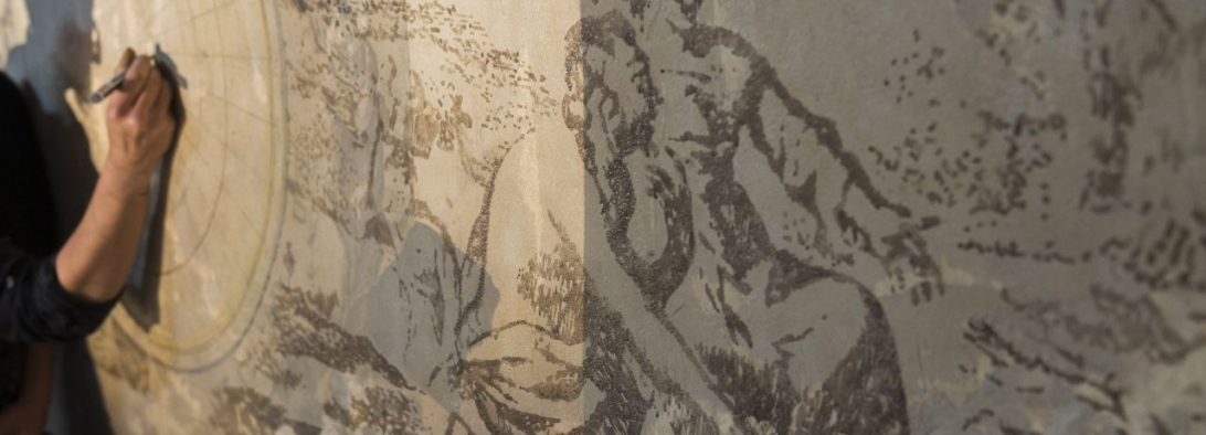
a mural of an antiquated world map, handdrawn on relief plaster.
The
woodfired ovens and copper piping in the Greenhouse have been aged for
authenticity. The space has been transformed with a glass roof
and revolving living wall, containing herbs and plants.
The Attic
Bar is a roof space with high beams, aged wine crates and barrels
and vintage furniture pieces.
www.mofongo.nl
Photo's courtesy of Tiemen Voorhorst
Mofongo’s Distillery, Groningen
View project
Spanning no less
than 4 floors, Mofongo’s distillery is a not so much a bar as an experience.
The cocktail robot Armando – featured in numerous hospitality
magazines– steals the show with it’s unique method of assembling cocktail
ingredients. The distillery is fully functioning.
Inspiration for the interior was drawn from raw industrial references; concrete, stone, stained and textured plaster, battered metal and steel, aged wood.
Mofongo’s
Distillery was voted Best Bar in the Netherlands 2013 by Proost Hospitality
magazine.
Photos courtesy of Tiemen Voorhorst.
Mofongos Coffee Bar, Groningen
View project
Mofongos comprises many different restaurant and bar spaces, spread over several buildings and floors. One space leads seamlessly into another.
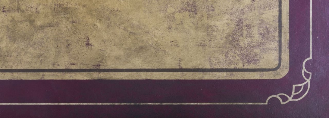
The Coffee Bar offers a wide range of single estate and blended coffees. The décor was influenced by small Belgian and Parisian cafes, and attempts to capture this warm, authentic atmosphere with its worn and textured walls, stencilled cartouche panelling and aged wood.
Photos courtesy of Tiemen Voorhorst.
www.mofongo.nl
Photos courtesy of Tiemen Voorhorst.
www.mofongo.nl
Krazy Kangaroos, Enschede
View project
This indoor
trampolining centre Krazy Kangaroos is situated in Enschede.
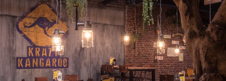
For the Australian outback themed restaurant area Mumford Visuals was commissioned by Mint Interieur Projecten to create a number of decoratieve elements; industrial concrete walls, aged yellow wood cladding and various painted signs and logo’s.
Photos courtesy of Mint Interior Projects/Krazy Kangaroos
Photos courtesy of Mint Interior Projects/Krazy Kangaroos
Changing Life, Amsterdam
View project
Changing Life is a Personal
Lifestyle and Coaching concept, based in an old steel factory. It is situated
in one of the revitalised docks north of the river Ij in Amsterdam, an area currently home to many new creative enterprises.
The industrial vintage interieur and styling was designed by award winning Dutch design company Nicemakers, who commissioned Mumford Visuals to design and realise the extensive signing needed within the building complex.
The industrial vintage interieur and styling was designed by award winning Dutch design company Nicemakers, who commissioned Mumford Visuals to design and realise the extensive signing needed within the building complex.
Drawing inspiration from the previous function of the building as factory and the new gym concept -
whereby floor markings would delineate both spaces - a system of floor lines with text was designed and hand painted throughout all gym and office areas.
Photos courtesy of Tiemen
Voorhorst
www.changinglife.cl
Hotel Post Plaza, Leeuwarden
View project
Hotel Post Plaza is a city hotel in the heart of Leeuwarden, in the Province of Friesland. Its current identity is based upon and inspired by its former function as a Post Office.
The building itself is impressive in scale and lends itself to dramatic visual statement. Interior design elements include a hand painted colour mural of the film poster 'The Postman only rings twice', filling an entire end wall, and a large
black and white mural taken from a photograph of a postman who was local to the area many years ago. The entrance area has 2 murals; these are poems in the Fries language, and are intended as an ode to the postman.
Commissioned by Stars Design, Rotterdam
Photos courtesy of Tiemen Voorhorst
The Admiraal, Zwolle
View project
The Admiraal is a restaurant in the centre of Zwolle.
It takes its inspiration from its former function as the residence of Admiral Jan Pieter van Braam, a famous seaman who served a long period of office and sailed for the East India Dock Company.
The decor reflects this period in history and includes murals of vintage postcards of historical landmarks in Zwolle.
Photos courtesy of Tiemen Voorhorst
Canon Cafe, Nederlands Openluchtmuseum, Arnhem
View project
The Nederlands Openluchtmuseum is a museum of Dutch history, situated in a large museum park and comprising many buildings typical of different historical periods. It offers an insight into the history of Dutch culture and customs.
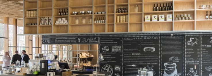
The Canon Cafe is the main restaurant in the museum complex. Mumford Visuals was commissioned by Vijverborgh Hospitality to design and realise the chalkboard signing, of which the restaurant decor is mainly comprised.
Photographs courtesy of Tiemen Voorhorst
www.openluchtmuseum.nl
Chalkboards
View project
People need concise information, and chalkboards remain one of the most effective and visually attractive means of showcasing menu options.
Creating innovative and contemporary quality chalkboards is an ongoing and enjoyable challenge. Here are some examples, from pure lettering to a mix of painted imagery and text.






-1092x394.jpg)
-737x266.jpg)



-1092x394.jpg)
-737x266.jpg)
-1092x394.jpg)
-737x266.jpg)


-1092x394.jpg)
-737x266.jpg)
